Johann Sebastian Bach (1685-1750), a German musician and composer in the Baroque period, was well-known for developing his own style of music. Back in his day, Bach’s works were considered too conservative. It wasn’t until after his death did people start taking notice of his music. Since then, Bach’s compositions have been highly regarded for their technical, artistic and intellectual depth.
Today, he is fondly remembered as a great Baroque-era composer and he is one of the few composers with events dedicated to commemorate his legacy. In March this year, an event, timed to coincide with Bach’s birthday, was held in various cities around the world to celebrate his famous compositions.
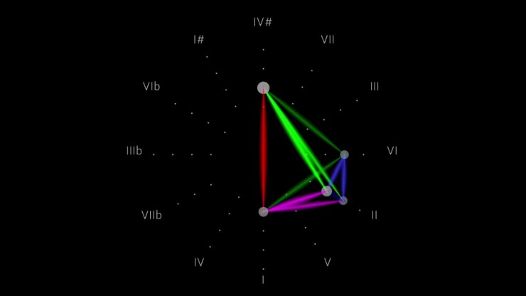
Among Bach’s various works, The Well-Tempered Clavier has been gaining attention lately due to the release of modern visualisations based on it. A London-based music company recently came up with a such a visualisation, bringing this 18th-century piece closer to modern-day music-lovers.
The Well-Tempered Clavier, also referred to as WTC, is a collection of two series of Preludes and Fugues in all 24 major and minor keys. “Clavier” was a generic term meant for various keyboard instruments, mainly the harpsichord or clavichord, but sometimes the organ. On the other hand, “Well-Tempered” points to the system of tuning; where all twelve notes in an octave of a standard keyboard are tuned in a certain way which enables most major or minor keys to be played together in the same piece of music, without sounding out of tune.
Now, two other people have brought Bach’s masterpiece to another level.
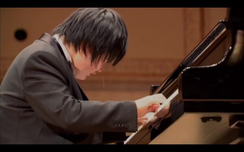
In the Open Well-Tempered Clavier project, Kimiko Ishizaka performed and recorded all the preludes and fugues from the first series of The Well-Tempered Clavier (WTC Book I).
Using Kimiko’s performance of Bach’s Prelude in C Major, Stephen Malinowski, the inventor of the Harmonic Colouring Method, created animated graphical scores that became a visual representation of this well-known piece. This was done by assigning colours to the various music pitches and rendering them in their visual forms on a computer.
In the first version, which is the original Music Animation Machine (MAM) score, the notes are arranged in a radius to mimic the petals of a flower. They are coloured to represent the pitch classes according to the Harmonic Colouring Method.
As the first version could not show the other technical components of the music, a second version was created to present the note intervals. Similarly, they were also assigned different colours, with the notes arranged according to the circle of fifths.
Stephen Malinowski has further developed the MAM, resulting in different visual scores that allow for the viewing of the chord intervals, tonality, overtone interactions, triadic relationships and more. He also went on to develop an application, “Harmonizer”, for the iPad in 2010. It was to serve as an interactive tool to help children learn pitch identities and develop perfect pitch by showing the pitch that is being sung. In addition, it allows adults to study chord relationships.
These are many interesting ways to allow the audience, especially non-musicians, to appreciate the beauty of classical music. With the rapid advancement of modern technology, we can all look forward to having more of such aesthetically-pleasing music showcases in the future.
